Frequency Polygon Calculator
Using this frequency polygon calculator, you can visualize the frequency distribution of the given dataset in the form of a frequency polygon graph. You can also view the ogive chart and the related statistics of the polygon chart created using the set of data points.
What is a frequency polygon graph?
The frequency polygon in statistics is different from frequency 〰️ in Physics. In statistics, the frequency of a value refers to the number of times the value occurs in a dataset (more about it in the frequency distribution calculator). The histogram calculator provides another way of visualizing the data.
A histogram of the frequencies of all values in the dataset is called a frequency distribution. The frequency polygon calculator forms the graph by connecting the frequencies of the values by a line graph instead of representing them as a bar graph. Thus, we see that the histogram and frequency polygon are different representations of the same dataset.
The frequency distribution polygon also helps us visualize if our dataset follows a specific type of distribution, such as:
- Normal distribution;
- Log-normal distribution;
- Exponential distribution;
- Poisson distribution, etc.
What is an ogive graph?
An ogive graph is similar to the frequency polygon, but instead of using frequency values, we'd use cumulative frequency values of the numbers in the dataset.
The cumulative frequency polygon maker will draw the cumulative frequency graph or the ogive graph as follows:
- Find the frequency of each unique value in the dataset.
- Create the ogive chart by finding the cumulative frequency for each value.
- Create a scatter plot of values vs. cumulative frequency.
- Form the ogive graph by connecting the points in the scatter plot!
🙋 If you like presenting data in a fancy way, we recommend trying our stem and leaf plot calculator.
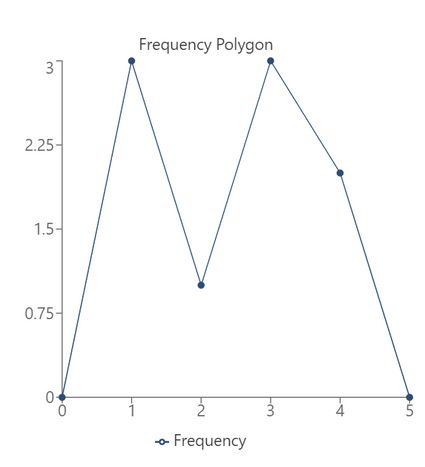
Frequency polygon example
Let's say we want to generate the frequency polygon for the following data points:
1 | 1 | 1 | 2 | 3 | 3 | 3 | 4 | 4 |
|---|
The frequency chart for this dataset will look like this:
Number | Frequency |
|---|---|
1 | 3 |
2 | 1 |
3 | 3 |
4 | 2 |
Based on this, the frequency polygon is generated by the frequency polygon calculator as follows:
Ogive graph example
For the same dataset shown above, the cumulative frequency polygon calculator will draw the cumulative frequency polygon as shown here, through which we can understand what an ogive graph is:
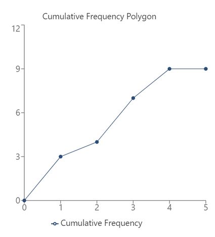
In this manner, we can construct the cumulative frequency polygon for the given data. We can also find the relative frequency of each value in the given dataset if needed.
How do I use the frequency polygon maker?
To construct a frequency polygon using the frequency polygon maker, do the following:
-
If you want grouped data, simply key in all the values in the dataset (up to 50).
-
You can also set the starting value and group size if you like. Otherwise, they are set automatically.
-
If you want ungrouped data, select the ungrouped data option in the frequency type.
-
You can then view the frequency polygon.
-
In case you want to draw a cumulative frequency graph, select cumulative frequency – tada! Based on the frequencies, you'll see the ogive graph!
Using the frequency polygon calculator, you can find all the following:
-
Frequency polygon of ungrouped data;
-
Frequency polygon of grouped data;
-
Cumulative frequency polygon or ogive graph of ungrouped data;
-
Cumulative frequency polygon or ogive graph of grouped data;
-
Frequency statistics of the polygon chart and ogive statistics, such as:
- Mode;
- Median;
- Mean;
- Standard deviation;
- Range;
- Variance;
- ... and many more!
FAQ
What is the difference between frequency polygon and histogram?
A frequency polygon is a line graph, while a histogram is a set of adjacent rectangles whose width represents the interval. The frequency of each interval is represented with a point in a frequency polygon, whereas it is represented with the height of the rectangle in a histogram.
How do we interpret a frequency polygon?
Each point in the frequency distribution polygon represents a particular value in the dataset and its corresponding frequency. The y-coordinate of the point represents the number of occurrences of that value. This will help us visualize which values are the most frequent and which ones are the least frequent in our dataset.
How do we create a frequency polygon?
To create a frequency polygon, we would do the following:
- Create a frequency chart by finding the frequency of each unique value in the dataset.
- Plot each of these points
(value, frequency)on a graph to get a scatter plot. - Join these points using lines to construct the frequency polygon!